geom_epicurve() draws a classical epidemiological curve in which every
individual case is rendered as a small square stacked on top of others
sharing the same date (or other binning unit on the x-axis). The
companion stat, stat_epicurve(), assigns each case a vertical
stacking position within its x-value bin.
Usage
geom_epicurve(
  mapping = NULL,
  data = NULL,
  stat = "epicurve",
  position = "identity",
  ...,
  width = NULL,
  height = 0.9,
  max_stack = 20,
  symbol = NULL,
  symbol_size = 3,
  auto_aspect = TRUE,
  na.rm = TRUE,
  show.legend = NA,
  inherit.aes = TRUE
)

stat_epicurve(
  mapping = NULL,
  data = NULL,
  geom = "rect",
  position = "identity",
  ...,
  width = NULL,
  height = 0.9,
  max_stack = 20,
  symbol = NULL,
  symbol_size = 3,
  na.rm = TRUE,
  show.legend = NA,
  inherit.aes = TRUE
)
Arguments
- mapping
Set of aesthetic mappings created by
ggplot2::aes().- data
The data to be displayed in this layer.
- stat
The statistical transformation to use on the data; defaults to
"epicurve".- position
Position adjustment, defaults to
"identity".- ...
Other arguments passed on to
ggplot2::layer().- width
Numeric width of each case square in x-axis units. If
NULL(the default), automatically determines appropriate width based on the time unit: 0.9 for daily Date data, 3600 seconds for hourly POSIXct data, 6.3 for weekly data, etc. Specify explicitly to override auto-detection.- height
Numeric height of each case square in y-axis units; defaults to
0.9. Values below 1 produce visible gaps between stacked cases.- max_stack
Numeric threshold for switching from individual case squares to a column chart. If the maximum count at any x-value exceeds this threshold, the plot automatically displays as a column chart instead of stacked squares. Set to
NULLto always show squares (default:20).- symbol
Character string specifying a Unicode symbol or emoji to use instead of squares (default:
NULLfor squares). When provided, each case is rendered as the specified symbol. Examples:"●"(bullet),"■"(square),"▲"(triangle),"♥"(heart),"😷"(face mask emoji). Ignored ifmax_stackthreshold is exceeded (uses column chart instead). Pass a named character vector (e.g.c(Female = "♀", Male = "♂")) to use different symbols per category; the names are matched against the discrete aesthetic mapping (typicallycolourorfill).- symbol_size
Size of symbols when
symbolis used (default:3).- auto_aspect
Logical. When
TRUE(the default),coord_epicurve()is added automatically so datetime (hourly / sub-daily) plots get a shorter panel that makes each case rectangle look approximately square instead of a tall, narrow stick. For Date / numeric x axes no aspect ratio is imposed. Set toFALSEto manage the coordinate system yourself. Adjust if symbols appear too large or small relative to the plot.- na.rm
If
FALSE(the default), missing values are removed with a warning.- show.legend
Logical. Should this layer be included in the legends?
- inherit.aes
If
FALSE, overrides the default aesthetics rather than combining with them.- geom
The geometric object to use; defaults to
"epicurve".
Value
A ggplot2 layer that can be added to a ggplot2::ggplot() object.
Details
Because the geom delegates drawing to ggplot2::GeomRect, all of the
usual rectangle aesthetics are supported (fill, colour, alpha,
linewidth, linetype) and integrate naturally with any ggplot2
scale, theme, facet, or coordinate system.
Aesthetics
geom_epicurve() understands the following aesthetics (required in
bold):
x— typically aDaterepresenting the date of onset.y— supplied automatically bystat_epicurve().fill,colour,alpha,linewidth,linetype,group.
Interactive Visualisation
Convert to interactive plotly plots using plotly::ggplotly():
library(plotly)
p <- ggplot(cases, aes(x = onset_date)) +
  geom_epicurve(fill = "steelblue") +
  theme_minimal()
ggplotly(p, tooltip = c("x", "y"))
For custom tooltips, add a text aesthetic and use the tooltip parameter:
cases$tooltip <- paste("Case ID:", cases$case_id)
p <- ggplot(cases, aes(x = onset_date, fill = age_group, text = tooltip)) +
  geom_epicurve()
ggplotly(p, tooltip = "text")
See also
simulate_outbreak() for generating example data, scale_y_epicurve() for integer y-axis labels.
Examples
library(ggplot2)
cases <- simulate_outbreak()
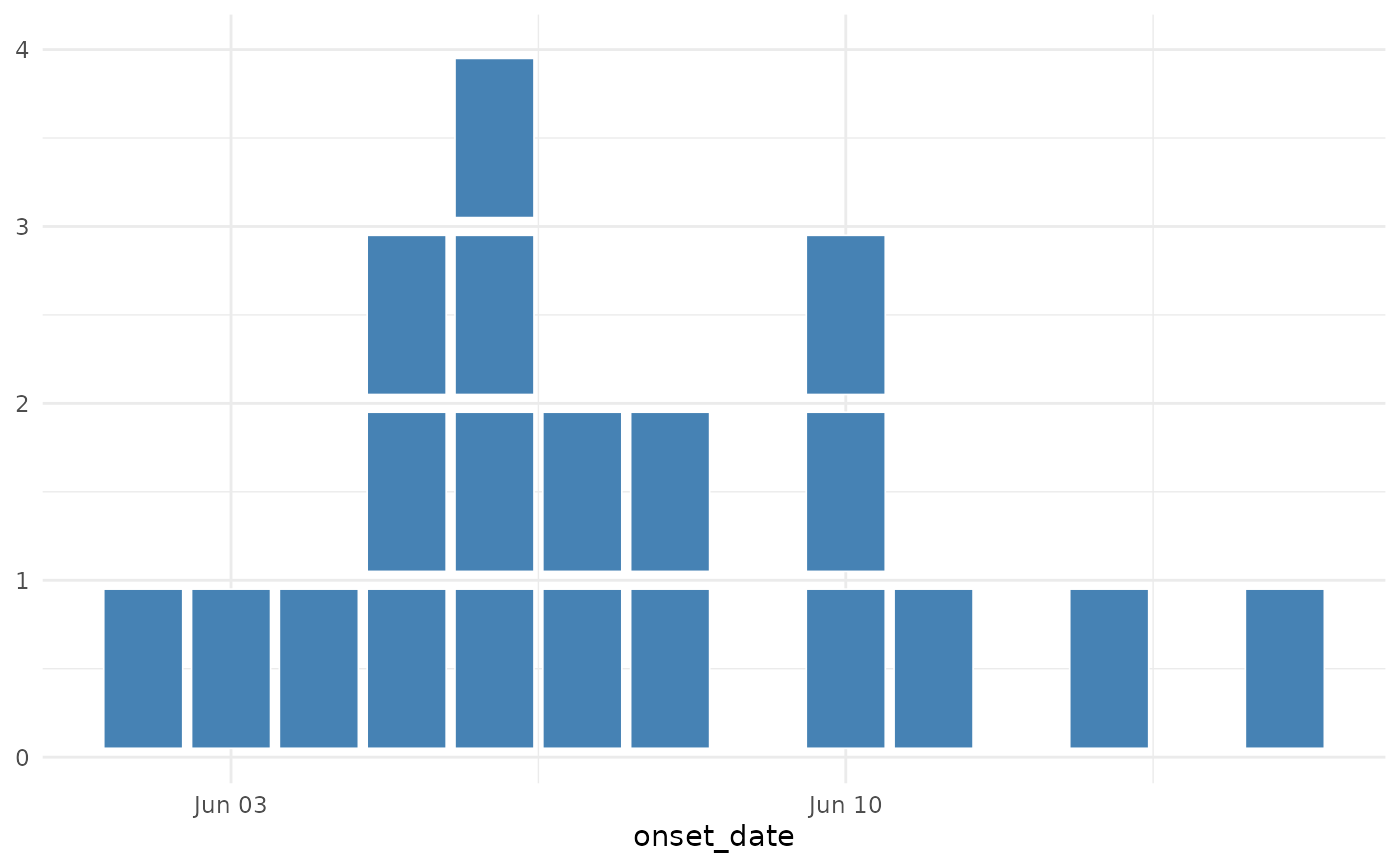
# Minimal epicurve (daily data)
ggplot(cases, aes(x = onset_date)) +
geom_epicurve(fill = "steelblue") +
theme_minimal()
 # Coloured by age group, faceted by setting
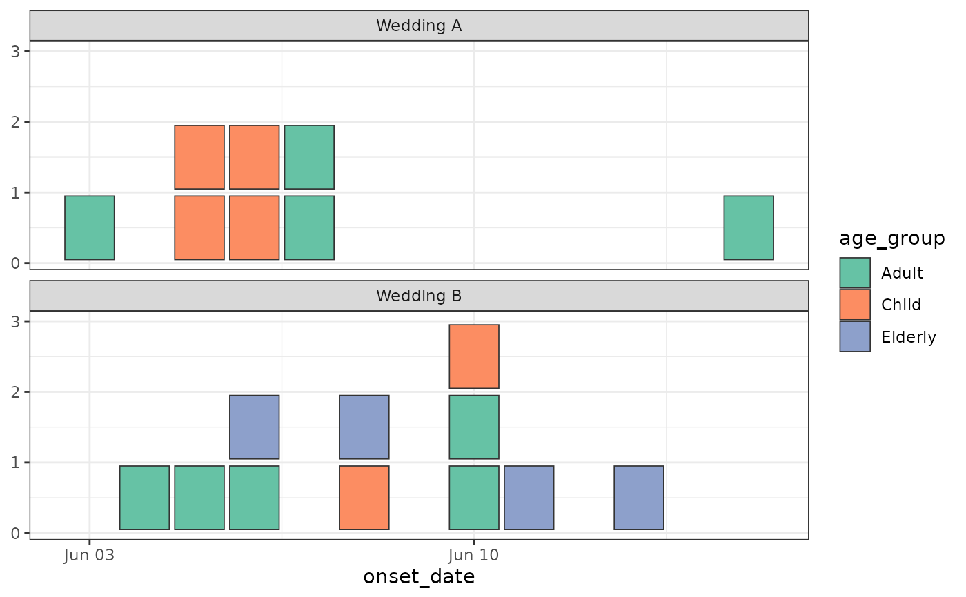
ggplot(cases, aes(x = onset_date, fill = age_group)) +
geom_epicurve(colour = "grey20") +
facet_wrap(~ setting, ncol = 1) +
scale_fill_brewer(palette = "Set2") +
theme_bw()
# Coloured by age group, faceted by setting
ggplot(cases, aes(x = onset_date, fill = age_group)) +
geom_epicurve(colour = "grey20") +
facet_wrap(~ setting, ncol = 1) +
scale_fill_brewer(palette = "Set2") +
theme_bw()
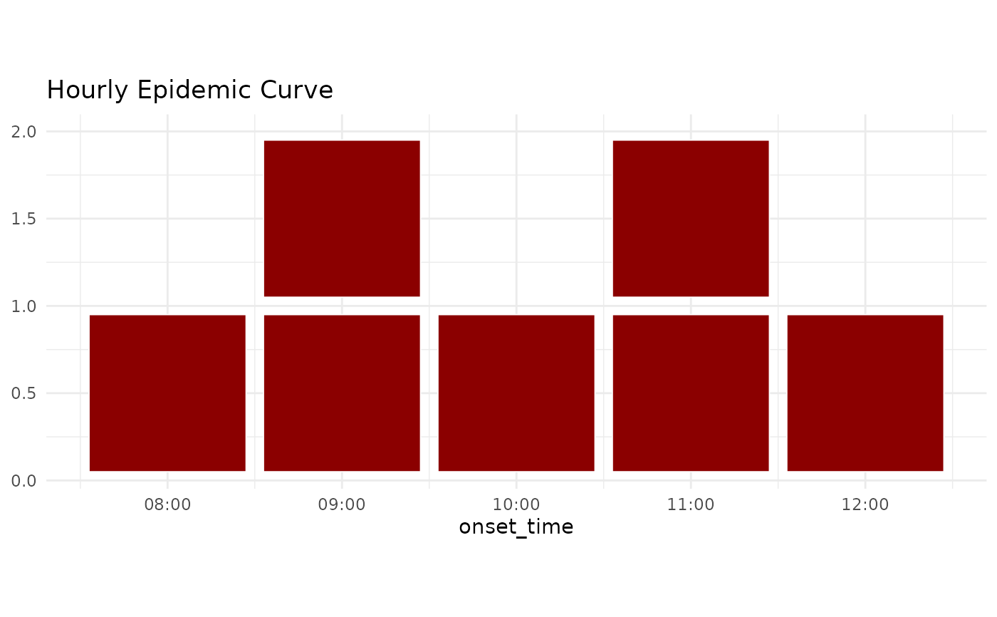
 # Hourly data (width auto-detects from POSIXct intervals)
hourly_cases <- data.frame(
onset_time = as.POSIXct("2024-06-01 08:00:00") + 3600 * c(0, 1, 1, 2, 3, 3, 4),
case_id = 1:7
)
ggplot(hourly_cases, aes(x = onset_time)) +
geom_epicurve(fill = "darkred") +
theme_minimal() +
labs(title = "Hourly Epidemic Curve")
# Hourly data (width auto-detects from POSIXct intervals)
hourly_cases <- data.frame(
onset_time = as.POSIXct("2024-06-01 08:00:00") + 3600 * c(0, 1, 1, 2, 3, 3, 4),
case_id = 1:7
)
ggplot(hourly_cases, aes(x = onset_time)) +
geom_epicurve(fill = "darkred") +
theme_minimal() +
labs(title = "Hourly Epidemic Curve")
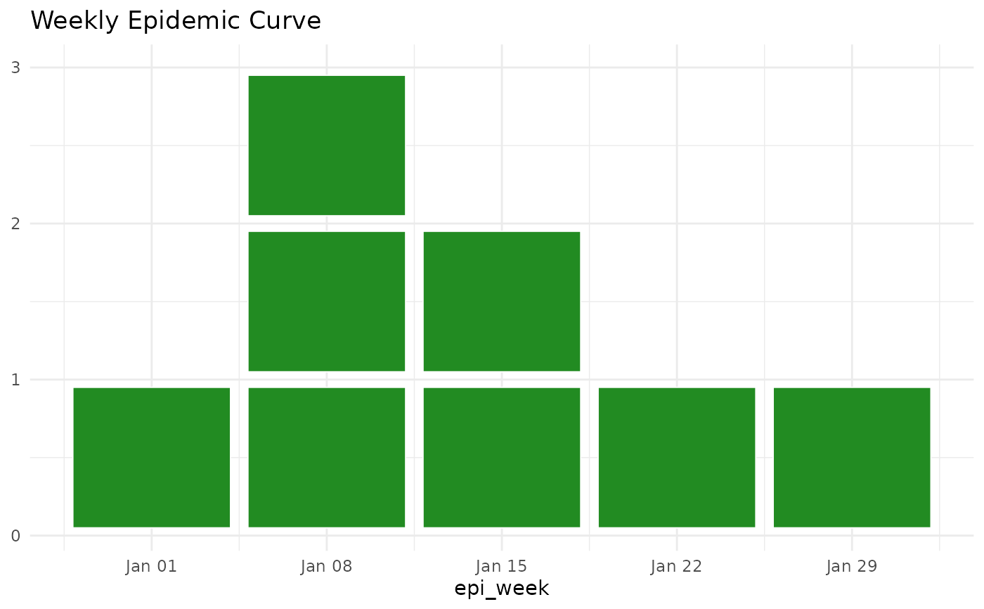
 # Weekly data (width auto-detects from Date intervals)
weekly_cases <- data.frame(
epi_week = as.Date("2024-01-01") + 7 * c(0, 1, 1, 1, 2, 2, 3, 4),
case_id = 1:8
)
ggplot(weekly_cases, aes(x = epi_week)) +
geom_epicurve(fill = "forestgreen") +
theme_minimal() +
labs(title = "Weekly Epidemic Curve")
# Weekly data (width auto-detects from Date intervals)
weekly_cases <- data.frame(
epi_week = as.Date("2024-01-01") + 7 * c(0, 1, 1, 1, 2, 2, 3, 4),
case_id = 1:8
)
ggplot(weekly_cases, aes(x = epi_week)) +
geom_epicurve(fill = "forestgreen") +
theme_minimal() +
labs(title = "Weekly Epidemic Curve")
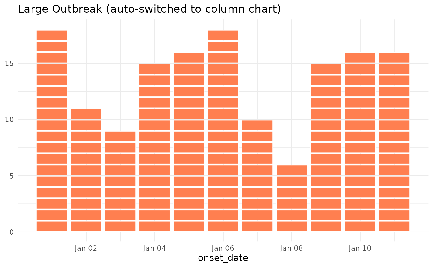
 # Automatic column chart for large outbreaks (max_stack threshold)
# When any date has > 20 cases, automatically switches to column chart
large_outbreak <- data.frame(
onset_date = as.Date("2024-01-01") + sample(0:10, 150, replace = TRUE)
)
ggplot(large_outbreak, aes(x = onset_date)) +
geom_epicurve(fill = "coral", max_stack = 20) +
theme_minimal() +
labs(title = "Large Outbreak (auto-switched to column chart)")
# Automatic column chart for large outbreaks (max_stack threshold)
# When any date has > 20 cases, automatically switches to column chart
large_outbreak <- data.frame(
onset_date = as.Date("2024-01-01") + sample(0:10, 150, replace = TRUE)
)
ggplot(large_outbreak, aes(x = onset_date)) +
geom_epicurve(fill = "coral", max_stack = 20) +
theme_minimal() +
labs(title = "Large Outbreak (auto-switched to column chart)")
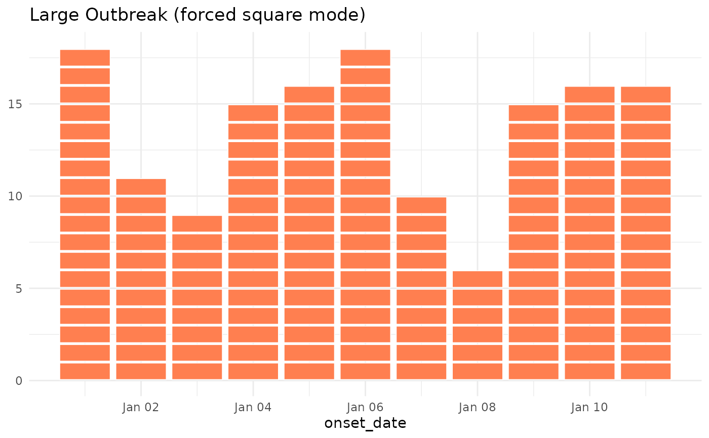
 # Force square mode even for large counts by setting max_stack = NULL
ggplot(large_outbreak, aes(x = onset_date)) +
geom_epicurve(fill = "coral", max_stack = NULL) +
theme_minimal() +
labs(title = "Large Outbreak (forced square mode)")
# Force square mode even for large counts by setting max_stack = NULL
ggplot(large_outbreak, aes(x = onset_date)) +
geom_epicurve(fill = "coral", max_stack = NULL) +
theme_minimal() +
labs(title = "Large Outbreak (forced square mode)")
 # Use symbols instead of squares (Unicode glyphs need font support;
# not rendered during R CMD check on minimal devices)
if (FALSE) { # \dontrun{
cases_symbols <- simulate_outbreak(n = 30, seed = 999)
ggplot(cases_symbols, aes(x = onset_date)) +
geom_epicurve(symbol = "\u25CF", symbol_size = 4, colour = "darkblue") +
theme_minimal() +
labs(title = "Epidemic Curve with Bullet Symbols")
# Use emoji symbols (requires font support)
ggplot(cases_symbols, aes(x = onset_date, colour = sex)) +
geom_epicurve(symbol = "\U0001F637", symbol_size = 5) +
scale_colour_manual(values = c("Female" = "#D55E00", "Male" = "#0072B2")) +
theme_minimal() +
labs(title = "COVID-19 Cases with Face Mask Emoji")
} # }
# Use symbols instead of squares (Unicode glyphs need font support;
# not rendered during R CMD check on minimal devices)
if (FALSE) { # \dontrun{
cases_symbols <- simulate_outbreak(n = 30, seed = 999)
ggplot(cases_symbols, aes(x = onset_date)) +
geom_epicurve(symbol = "\u25CF", symbol_size = 4, colour = "darkblue") +
theme_minimal() +
labs(title = "Epidemic Curve with Bullet Symbols")
# Use emoji symbols (requires font support)
ggplot(cases_symbols, aes(x = onset_date, colour = sex)) +
geom_epicurve(symbol = "\U0001F637", symbol_size = 5) +
scale_colour_manual(values = c("Female" = "#D55E00", "Male" = "#0072B2")) +
theme_minimal() +
labs(title = "COVID-19 Cases with Face Mask Emoji")
} # }